Bean fintech web app
5 min read

Executive Summary
We were a team of three UX designers working on a three-week sprint for Bean on behalf of General Assembly.
We used the Agile Double Diamond methodology throughout the sprint.
Our challenge was to build upon Bean’s existing platform to provide users with a better understanding of their recurrent payments and motivate them to engage in taking action in optimising their spendings.
To achieve these, we worked on three main areas for improvement:
-
Designing a secure and trustworthy experience
-
Displaying the recurring payments information in a clear way
-
Presenting actionable insights to help users save money
We conducted user research, tested the current platform, created several iterations of clickable prototypes with different features and conducted several rounds of user testing, where we focused not only on the navigation and understanding of the features but also on the language, aiming at improving the sense of trust with the users.
In the end, we presented a high fidelity clickable prototype to the client, who has decided to implement many of the changes that we introduced in our version of Bean’s platform.
What is Bean?
Bean is a personal finance management tool that provides users with actionable insight on recurring payments, such as bills and subscriptions, direct debits and standing orders.
By connecting to the users’ bank accounts, Bean finds all the recurring payments and lets them know if they are overspending on any contracts. Allowing users to optimise their bills through proactive switching.
As a bonus, the company will cancel any unwanted contracts the user might have.
The company is also part of Barclays Accelerator ‘a 13-week programme run by a full-time, dedicated Techstars team.’

The Brief
We were tasked with creating a better experience for the core user of the platform. According to Bean’s research, their users are aged between 28–40, have several financial providers, mortgages and many standing orders and direct debits associated with various accounts.
Our job was to educate users as to where they will stand financially in the near future, suggest and allow them to take actions such as changing or cancelling an existing contract, helping the user plan for a better financial year.
My Role
Since we were such a small team, with very similar skills and capabilities, we decided to make all decisions as a group, and work collaboratively truth out the process.
I focused most of my efforts on the initial user research, by conducting several rounds of tests on the current version of the platform, creating storyboards, empathy maps and user journeys, leading a design studio session with stakeholders, sketching and rapid prototyping, conducting user testing, compiling and implementing findings to the iterations.
I also worked together with my colleague Idil Unal (who also has a Graphic Design background) on the visual aspects of the final design that we presented to the client.

User Research
To evaluate the effectiveness of Bean’s website and identify areas for improvement, we conducted eleven user interviews on existing active users of the platform, users of competitor financial management apps and two non-users who have trust issues with fintech.
We wanted to understand the users’ behaviours, what motivates them to use a personal finance management tool, what do they value, how they keep track of their direct debits and how they felt about giving away their personal bank details to a third-party provider.
We created empathy maps to synthesise what we gathered from the user interviews and tests. These maps allowed us to identify main areas to focus on and helped us to create personas that represented primary user groups.

Key Findings
Aggregation is necessary to gain understanding.
Even financially savvy users are unaware of all of their recurring payments.
There was a user that recently discovered she was paying for online magazine subscription she didn’t read.
Being able to see all of their recurring payments in one place in a clear and accessible format is something the users valued.

Transparency creates trust; being led to third-party sites creates doubt.
We discovered that users were very uncomfortable with providing their bank details to an unknown entity, so when they suddenly got taken to a third party website to compare providers without any warning, that insecurity raised more significant concerns of possibly being scammed.
Transparency is vital, especially in the fintech world. Users want to be able to trust a service that asks to be trusted, and they are more likely to continue using the product if they have a clear understanding of the company and that means knowing how the business works and who are the partners.

Prompts will result in action if they feel genuine.
Many users only review their recurring payments if they feel like they overspent or if they set up a reminder.
If Bean wants to help users review their recurring payments and act on them, then the messages sent needs to be well-timed and feel genuine, so users can see the value of what been is doing for them.

Users were in general happy to use a service like Bean to monitor their expenses. However, the feeling of lack of trust and transparency came out especially strong.
The Current Platform
After testing the existing platform with twenty users we discovered that most users liked the simplicity and ease of use, the fact that it does what it says it does, the cancellation assistance service was the most praised feature.
However, we noticed some significant problems that we had to tackle if we wanted to improve the user interaction and experience.
-
The majority of users do not trust the platform and would not want to introduce their bank details. (We later were informed by the stakeholder that the highest user drop is in fact when asked to do this.)
-
Users were finding the tone of voice to be inconsistent; this seemed to raise many trust issues.
-
Many users were finding hard to understand what was the benefit and purpose of the platform. They got what they saw but not why they would want to see it?
Proto-personas
Based on our empathy map, we drafted two proto-personas. This was an essential step for defining different user types, their habits and expectations. These helped us to keep the ideation process relevant to the user needs.

Primary Persona
Jonathan is married and a father of two young boys. He is in the process of moving his family into a new house. Jonathan wants to make sure that he is managing his contracts and bills efficiently so that he can save money.

Secondary Persona
Our research showed that there were a lot of younger users who were less financially savvy, and were new to the responsibilities of owning a house or leasing a car.
These younger users are also more likely to use fintech apps; they tend to trust them more than the big household financial providers.
So with that in mind, meet Samantha.
She is less concerned in saving and tends to lose track of her spendings, she loves shopping and does it on a regular basis, she also tends to sign up for subscriptions such as coffee bags or boxes of nuts and dried fruit. Samantha’s account by the end of the month is usually emptier than what she expects it to be.
Design Studio
Next, it was time to brainstorm ideas, so we went to Bean’s head office, presented our research findings and conducted a design studio workshop with the CEO and founder, the marketing manager and a member of the development team.
We sketched out features and wireframes for two scenarios and talked about the best ideas that we could include on the first prototype.
After the meeting with Bean, we had another look at the findings and ideas and decided that it was worth exploring a third scenario.
“Jonathan has recently moved his family into a new house. He wants to get a better
understanding of how much he is spending on his recurrent payments and see
if he has any saving opportunities in anticipation of his move.”

Design Principles
We simplify complex payments into their essential meaning and create a delightful experience that takes finance from mundane to memorable.
We create trust by communicating genuine insights to users that will help them save money and create smart habits.
SIMPLE - DELIGHTFUL - TRUST - GENUINE - SMART
Prototyping and User Testing
We decided which of the features were more fitting to solve our user’s problem by defining the user flows and sketching the corresponding wire flows on a whiteboard. From there we created a clickable paper prototype that could be tested.
Our focus was separated into three parts:
-
Building trust by improving the sign up process
“If I am getting to this site for the first time with no referral, I wouldn’t put in my info.” - Ali, 30, Web Developer
-
Update the Dashboard to add value to its usability
“I would like to be told about my next payments because this is information I don’t keep track of on my own” - Anjali, 28, UX Designer
-
Communicating savings opportunities to users in a genuine way that motivates them to take action
“It’s a separate third party website? I don’t know what this is. I see the logo is there from Bean and they are in partnership but this could be anything. I would just exit out now.” - Efrem, 38, UX Designer

Part One – The Trust Issues
The research and testings proved that users had problems trusting online applications and new companies accessing their bank details.
Users said that word of mouth enhances the sense of trust, as they were more likely to trust something a friend has recommended or if the masses are comfortable with it. Adding to that the recognition or association with a reputable organisation will also make it more reliable.
As mentioned before, Bean is part of the Barclays Accelerator programme. However, they don’t indicate the affiliation, on their landing page or anywhere on the platform. There seemed to be no specific reason behind this decision, so we advised them to embrace this relation. This was one of the most straightforward steps we took to reassure users of the company’s genuineness.
We then looked at a progress bar, tested the tone of voice used in the on-boarding process, made the copy more consistent throughout and added a two-step verification at the start.
To the users feel more secure, we also added a fill-in form for personal details. Having these forms also enabled us to speed up any cancellation of contracts by auto-filling.

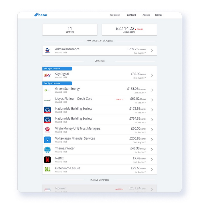
Part Two – The Dashboard
Finding out that there was an overpay due to the price increase of a bill, is one of the main occurrences that provoke the users to take action. With this in mind, we introduced two new features to the dashboard.
One was a showing upcoming payments in order to keep the users informed of all the upcoming payments on a monthly basis.
Another new addition was a pie chart that displayed the comparison of money spent between bills (essential spending) and subscriptions (non-essential spending).
During our usability tests, we found that this chart was not solving any problems. Users said that although it gave them the information in a clear way, it didn’t serve them to take action.
On the other hand, they could see the value in knowing the upcoming payments. The majority of users felt like knowing this was very useful, as it allowed them to plan ahead by cancelling subscriptions or comparing deals with other providers.

Part Three – Value
If the user felt like they were being sold something, they would not take action or care for the information displayed. So we had to test the tone of voice in order to captivate users to take action and see the value in Bean’s platform.
We wanted to better communicate the saving opportunities in a way that motivated users to take action, ensuring that user understood that by being taken to a third party comparison site was an incentive to optimise spendings by switching contracts and providers.
Test results showed that restructuring these opportunities and providing more information about them on the dashboard created more trust and engagement. By achieving this, we managed to educate users on how to save money and simultaneously fulfil the business goals.
On the current platform, Bean displays a ‘saving opportunity’ by highlighting it with a relevant message on the dashboard.
However, the initial test results showed that this message was seen as a sales push, and therefore was ignored by most users.
Another drawback was the fact that it took two steps to get to the information about the saving opportunity of a specific contract.
The user had to click to view the contract information, and only then he would get the insight. Meaning they had no knowledge of a possible saving opportunity just from being on the dashboard.
On one of the first iterations, we changed the placement of this ‘saving opportunity’ right under the relevant contract and included a button prompting users to see more information. By clicking it, they would be taken to contract detail page where would see the payment history and a suggestion box on how to save.
Users were still hesitant to click to see more information on the dashboard.
They felt like they were being sold something, so we tested different copy, (“did you know you can save”, “compare prices”) but none of these options performed well.

On the final iterations, we found that by moving the suggestion box from the contract detail page onto the dashboard and extending the copy to a more complete version explaining the saving opportunity or including tips that Bean might want to offer provoked the user to take action.
In Bean’s marketing campaign we saw the words “actionable insights” and thought it would be appropriate to use it to name this section.
Now the information was no longer hidden in subpages, so users could plainly see all the suggestions and tips from the ‘home’ dashboard.
We also included a disclaimer information about Bean’s third-party partners, making the experience more transparent and trustworthy for the users.


Results
Tests revealed that the platform now allows users to have a trusting experience as they see the value of using Bean. Even though the brief did not specify the need for any changes relating to trust, we found that this was the core problem that needed to be tackled to achieve user engagement. Displaying ‘actionable insights’ in an upfront clear way such as upcoming payments, or tips to save money was exceptionally well received by the users.
The team at Bean were happy with the fact we took into consideration what was already done by them when re-designing the platform, allowing the introduction of new features and menus to be feasible for implementation.
Bean is now in the process of integrating a lot of our work into the web app,
enhancing the business, and providing a better user experience.
Thanks for reading.