The Sunshine Store
The Sunshine / UX Design / ecommerce website
Student Project for General Assembly

Executive Summary
For the second project at GA, we created an ecommerce website for Sunshine Foods.
Sunshine Foods has been the city’s neighbourhood grocery store since 1998. Located in London, near Liverpool Street Station, they are proud to be part of a diverse and dynamic community. Their business model is based on providing a fantastic customer service and to offer local and fresh produce at reasonable prices.
This year, Sunshine Foods decided they wanted to reach a wider community by launching a new ecommerce website. They wanted customers to easily order online, and have the goods delivered at home or collected in store whilst still maintaining that ‘personal and local’ identity.
For this project I followed the double diamond process which consisted of competitive analysis, user interviews, finding a persona, card sorting, user journeys, experience maps, site maps, design studio, wireframes, and a low to mid-fidelity digital prototype.

Competitive analysis
Doing an in-depth investigation and analysis of Sunshine Food’s competition was key if they wanted to enter the ecommerce market.
I split the competitors in two, first focusing on big brands such as Whole Foods, Planet Organic and Ocado and then small ones like Alara and Borough Market.
I was surprised to learn that Whole Foods didn’t offer online shopping in this country, yet a shop as small as Alara did. So immediately I felt more of a connection with Alara in that it’s a small “family” styled company just like Sunshine Foods.

Store visit
After analysing some of the competitors, I decided to go to Planet Organic in Liverpool Street, and observed customer and staff behaviour.
Peopled seemed happy and staff well informed. The store felt very natural, clean and inviting and the products well categorised in the shelfs.
Getting in the zone
I found the whole process of understanding the market, the best possible way to ‘get in the zone’ and start getting creative with ideas.
Understanding how the competitors are structured, their values, key messages, and how they approach the customers was essential in helping me come up with ideas and possible features that I could include on Sunshine Foods website.
User research
I conducted 3 user interviews and it was my objective to get some insight into how people shop for groceries both online and offline, and what (if anything) makes the experience special for them.

I explored topics such as:
-
Preferred method of shopping and why: online vs in-store
-
General shopping habits
-
Healthy lifestyle habits
-
Importance of ingredients; freshness of food; quality
This research was used to validate a set of 3 user personas that were provided in the brief. After carefully analysing the data and organising the key findings into patterns, I discovered that the most relevant match was Charlotte, a 27 year old from London who enjoys cooking and healthy eating.

The journey begins
So after having a good understanding of the brief, the users and market competition, it was time to look at Charlotte’s journey.
Charlotte wants to be inspired to buy a gift for her foodie friend who
loves cooking healthy and organic food.
In this journey I wanted to represent a scenario where Charlotte enters Sunshine Foods’s website, explores the gift section, finds inspiration, goes to ‘building an hamper basket section’ and adds one to her favourites.

Card sorting
I conducted a few open card sorts to make sure the categorisation of products was intuitive to everyone. After confirming the results with some closed card sorts, I picked up on some trends and managed to define six main categories and sixteen sub-categories.

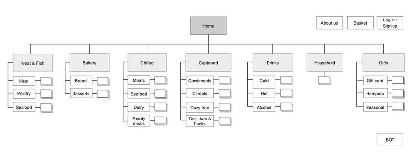
Organising the site
Now that that all the products were organised into separate pots, it was time to work on the website navigation. I put together a sitemap containing all the categories and subcategories revealed by the card sorting results, and introduced a ‘gifts’ tab with the ‘hamper basket builder’ function.
Design studio
I got together with some of my colleagues to discuss ideas and wireframes for each other’s projects — we were all working on Sunshine Foods website, but everyone was focusing on a different journey.
This exercise was extremely useful as it allowed us to collaborate, discuss and iterate ideas, leading to a shared vision and a more coherent solution.

Wireframes
I created three iterations of the website.
The first two versions were low fidelity, being that the first was a paper prototype and the second was a digitalised version that incorporated some changes after analysing the feedback of several rounds of user testing.

On the image above you can see the third iteration of the hamper basket personaliser page next to the paper prototype.
Some of the content was moved to provide a better user experience, such as the price on the basket itself. The ‘add to basket’ button was missing from the Low-fi, and two buttons were placed on the Mid-fi, one at the top and one at the bottom, in case the amount of content forces the user to scroll down.
Also the amount of info about the items inside the basket was reduced.
You can navigate the prototype here.