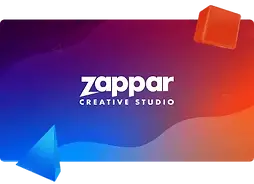
Zappar branding
5 min read

Unified diverse Zappar sub-brands, overcoming challenges with brand consistency. Implemented "Connective Tissue" for a cohesive brand experience to reshape Zappar's brand for recognition, trust, and loyalty.
My role
Lead and solo designer—project management, pitching, stakeholder conflicts, facilitated workshops, brand guidelines, logo design and design mentorship.
Brand Unity in Zappar's Ecosystem
Introduction:
As the Lead Designer at Zappar, a prominent figure in the extended reality (XR) industry, I recognised the importance of updating their visual identity to create a more cohesive brand. This case study shares the process of unifying their sub-brands into recognisable visual identities.

My Role:
As part of my design responsibilities, I was at the forefront of Zappar's new brand strategy. In addition to designing and establishing guidelines, I oversaw the work done by the design and marketing teams. My role involved ensuring that the design system and brand guidelines were consistently developed and integrated with the marketing team's needs. I organised and facilitated workshops and worked closely with stakeholders to ensure that the sub-brands remained consistent.
Sub-Brands and Offerings:
Zappar encompasses multiple brands, each with distinct offerings:
-
Zapworks: XR tools, training, and webinars for users of all levels
-
Zappar Creative Studio: An in-house agency crafting XR content and campaigns using Zapworks tools
-
Zapbox: A mixed-reality kit containing a headset and controllers, leveraging smartphone integration for immersive experiences
-
Zapvision: Enabling blind and partially sighted individuals to find and access product information via smartphone cameras and accessible QR codes
-
Mattercraft: A unique tool to create XR content and 3D websites, standing as an independent brand due to its distinct functionalities

Challenges:
The branding of Zappar and its sub-brands was inconsistent and outdated, resulting in a lack of coherence. Nonetheless, it was important to maintain a sense of familiarity when working on the new style guide.
Throughout the project, I encountered divergent viewpoints from stakeholders representing different sub-brands, advocating for distinctive logos, which presented a challenge to the unification goal.
I made adjustments to all sub-brand logos to ensure they had a consistent starting point and the iconic Zappar bolt would be the unifying element, visually connecting all logos. Each sub-brand received a customised version of the bolt included in its logo. Through negotiations and alignment efforts, we reached a consensus. Happy days.
The brand deployment had to be done in stages due to resource limitations, which could result in inconsistency as both old and new brands would be live simultaneously.
Objective:
The objective was clear: establish brand consistency across Zappar's sub-brands to enhance recognition, trust, and loyalty while communicating the unique personality of each brand.
The Power of Brand Consistency:
Establishing brand consistency goes beyond just having a visually appealing image. It's about building trust and showcasing personality. By doing so, it fosters loyalty and recognition by creating a sense of familiarity and trust between the audience and the brand.
The advantages are plentiful:
-
Strengthen customer trust and loyalty by making the brand approachable and consistent
-
Setting Zappar apart from competitors by creating an emotional connection that resonates with customers
-
Elevate brand authority, positioning Zappar as a leader in the industry
-
Through consistency, establish brand recognition, a key driver of lasting customer relationships
Designing a unified identity:
I developed a set of elements I called "Connective Tissue" that served as a basis for all brands. This approach seamlessly wove together a cohesive brand experience while accommodating the unique personality of each sub-brand:
Typography: Consistent typography is key to a cohesive brand identity. I used one typeface and the same rules for all sub-brands to establish a recognisable and unified visual language.

UI components: I made a shared library of UI components for our sub-brands to ensure a consistent and easy-to-use experience. This helped us maintain visual harmony and streamline the user journey.
Layered Imagery: By using layered imagery, I was able to add depth and tangibility to the XR experiences, giving a sense of augmentation to products and features.


.webp)
Consistent Backgrounds: Having the same background patterns but with each brand colour helped maintain a consistent visual experience while keeping a cohesive look and feel throughout the ecosystem.


Minimalist 3D Shapes: Using minimalist 3D shapes that echo the background aesthetics, sprinkled in images, videos, and social media posts to help provide users with a sense of familiarity.

.webp)
.webp)
Photography: The photography strategy I curated captures the essence of Zappar's vibrant culture. Candid moments of collaboration and engagement reflect the authentic spirit of the team, steering clear of staged or overly posed shots. This approach adds a human touch, resonating with audiences on a relatable level.

Revamping Logos: While analysing the existing logos, I identified inconsistencies that need to be addressed. Character spacing, size, capitalisation and positioning were different between all sub-brand logos.

Mattercraft Branding Journey:
This tool is an extension of Zapworks and has undergone a unique branding journey. It was originally named "Foundry" and designed to be sold separately from Zapworks. The unique design had fiery tones to enhance the idea of forging. However, there were SEO implications and a decision was made to keep it closer to Zapworks, calling for a new approach.

"Mattercraft" is a term intended to describe the process of using materials in the ether to create something new. Similar to witchcraft and the transformative nature of alchemy, "Mattercraft" exudes skill to create XR experiences that effortlessly connect the real and digital worlds.

As this product retains the possibility of being sold separately from a Zapworks plan, I decided to create something new while staying true to its roots. While developing this brand, I made sure to include some of the same design elements seen in Zappar's brands, such as similar shapes, layered imagery, fonts, components, and site structure. However, I also added its unique touch to make this brand stand out as its distinct entity, while still maintaining a connection to its cousin, Zappar. The name "Mattercraft" inspired an organic and mystical design direction. Shapes reminiscent of raw materials taking form were combined with an iridescent colour palette, reflecting both mysticism and creativity. the process of using materials in the ether to create something new. Similar to witchcraft and the transformative nature of alchemy, "Mattercraft" exudes skill to create XR experiences that effortlessly connect the real and digital worlds.

Conclusion:
Along with my team, I creatively reshaped Zappar's brand and sub-brands by transforming a fragmented landscape into a cohesive, immersive narrative. My commitment to unification by design using the Connective Tissue approach, iconic logos, and strategic use of colour and graphic elements resulted in a portfolio that inspires recognition, trust, and loyalty to the company.

.webp)